Tags
No prizes for guessing which city I have to be in, and which city I want to be in! A special mention to Montreal for (just) taking me outside of UK & US!
My 2017 flights, slightly transparent pen so that repeated routes stand out.
14 Sunday Jan 2018
Posted in Data visualisation, Geo data
Tags
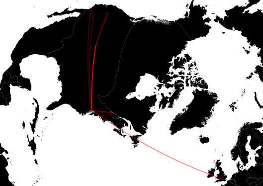
No prizes for guessing which city I have to be in, and which city I want to be in! A special mention to Montreal for (just) taking me outside of UK & US!
My 2017 flights, slightly transparent pen so that repeated routes stand out.
02 Tuesday Dec 2014
Posted in Uncategorized
My first use of the Wisconsin Transverse Mercator (3070). Something tells me not my last…

PS: The previous edition of this map was judged to be too boring…

23 Sunday Nov 2014
Posted in historical maps
Tags
In 10 years of photography and backpacking, my college roommate and I haven’t done badly at seeing the world!

04 Saturday Oct 2014
Posted in Geo data
Tags
All of the world’s flight routes coloured by length.

Contributing layers

Red: Inter-continental flights, greater than 3,300 km (~2,000 miles).

Green: Continental flights, between 1,400 and 3,300 km (900 – 2,000 miles)

Blue: Short flights, between 500 and 1,400 km (300 – 900 miles).

Yellow: Really short flights, less than 500 km (300 miles).
Flight data from openflights.org (modified); country shapes from thematicmapping.org. Robinson projection.
03 Wednesday Sep 2014
My previous post made me wonder about the CO2 emissions I’m responsible for. Spoiler: Quite a lot.
My defence: I fly less, stay longer. This is illustrated by the map below that shows open jaw flights. I travelled overland from blue airports to a red ones, sometimes (eg Quito to Rio) for quite a long way!

CO2 calculations: Based on these values for average CO2 equivalent emissions per passenger km, I have a lifetime CO2 footprint of 21.3 tonnes, which is only 722 kg / year. This is a bit misleading as I didn’t get to choose where I went on holiday UNESCed for the first half of my life. Over the last 10 years my average is 2.0 tonnes / year.
Is this a lot? According to the World Bank this is the same as the average emissions of a Peruvian. I like this comparison because I entered Peru in one of the most environmentally friendly ways I can imagine – sharing a medium sized car with seven other people … and a (live) chicken.
03 Wednesday Sep 2014
Posted in Geo data
I’ve been travelling (and UNESCing) for a few years, and wanted a way of visualising my personal travel history. One way is a map showing all of the flights that I’ve ever taken. Here I’ve coloured the flight path by year (blues are oldest, reds the most recent).

Some detail in Europe:

World map from thematicmapping.org, aerodromes from openflights.org.
